Gallery
Project Description
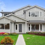
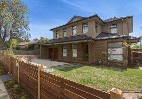
The striking multi-gable façade of this spacious family home leaves a lasting impression that doesn’t end at the front door. This property takes full advantage of the corner site it sits on, drawing in light from all angles to illuminate the interior.
Background
We originally spoke to the owners 3 years ago when they got in touch to discuss their ideas for a home that would accommodate their family as it continued to grow. Covid restrictions meant that the initial design process was slow, and we had a lot of back and forth before we could establish a realistic inclusion list that met all the needs of our clients.
Challenge #1 - Site Shape
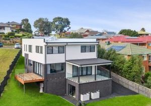
The tight angles of corner sites can cause headaches in the design stage of a build, and this one was true to form. The owners wanted to fit as much house as possible on to the site, and it took a lot of plotting before we pinned down a floorplan that ticked all the boxes. We worked with them to design a double storey house that spans almost the entire width of the site, giving an impressive 28 squares of interior space for the family to enjoy.
Challenge #2 - Local Council Approval
A new planning system was implemented in Mitcham while this project was in the pipeline, so we navigated the new procedures on behalf of the owners to obtain the necessary consent from the Local Council. Many of our clients overlook how complicated this process can be, and it can set the project back months if the application is filed incorrectly.
Our Solution
As the corner site left much of the house exterior exposed, the owners wanted the building to have as much street appeal as possible. We settled on a multi-gable design, which not only created visual interest, but also allowed us to create some added privacy for the upper storey rooms by setting them back behind the pitched roofs.
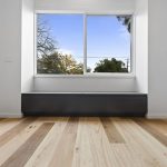
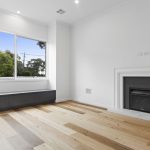
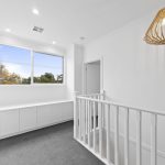
With a growing family, space and storage were a top priority, and we achieved both of these throughout the home by building slightly recessed windows which we filled with hidden storage benches.
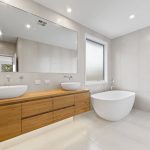
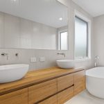
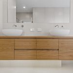
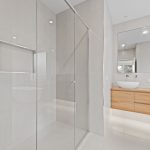
The accommodation includes 4 bedrooms, a playroom, family room, dining room, kitchen and utility. The main bathroom and master ensuite feature bespoke vanity units and tiled shower bases.
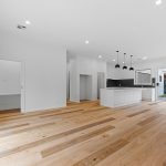
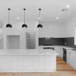
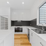
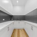
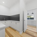
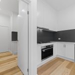
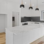
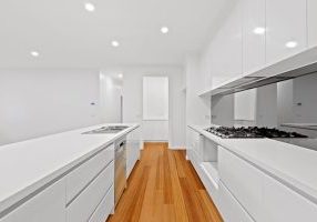
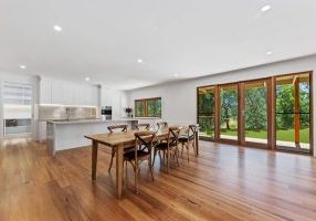
The open plan kitchen diner is the heart of the home, and with double width sliding doors along the east and west walls, the room is flooded with light all day long. We opted for handle less top level cupboards to give the kitchen a very natural minimalistic flow, and with wall to wall shelving available in the adjoining utility and butler’s pantry, the stone bench tops in the main kitchen space can be kept clear of clutter and appliances.
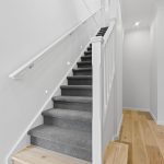
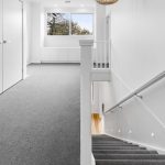
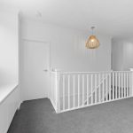
To create a relaxing ambience, we added LED downlights throughout the house, as well as custom lighting to the staircase and vanity units.
High gloss woodwork gives a contemporary feel throughout the house, and all materials such as carpets and flooring were chosen with the owner’s desire for clean minimalism in mind.
To the exterior of the house, we gave the alfresco added character by leaving the rafters exposed. The house is clad in weatherboard veneer for durability, and to complement the eye-catching property, we installed coloured concrete paving and new fencing around the perimeter.
Outcome
With the complex nature of the restrictive site on this project, it was worth giving the extra time to the design process, as it ensured that everyone was 100% happy with the end result. Once we overcame this initial delay, the rest of the build ran smoothly, and the owners were thrilled to finally get their foot in the door. As the old saying goes, good things come to those who wait!
